In the world of retail, your store layout is more than just an arrangement of shelves and products—it’s a powerful tool that can significantly impact customer behavior, satisfaction, and ultimately, your bottom line. This section will guide you through the art and science of creating store layouts that not only look great but also strategically enhance the shopping experience and drive sales.
Strategic Placement: Maximizing Visibility and Sales
Learn how to turn your store into a sales-driving machine through clever product placement:
High-Traffic Areas
Place high-margin items in high-traffic areas such as near the entrance, at the end of aisles, and close to the checkout counters. These locations ensure maximum visibility and increase the likelihood of spontaneous purchases.
Example: Sephora
Sephora places its “Hot Now” display stands near the entrance and checkout areas.
Sephora leverages the availability heuristic by making trending products highly visible. This placement increases the likelihood of purchases as customers enter or leave the store, capitalizing on moments when their decision-making guard may be lower.
– Availability Heuristic: Products in high-traffic areas are more mentally available, increasing the likelihood of purchase.
– Choice Overload: By presenting a curated selection in these areas, Sephora reduces decision fatigue.

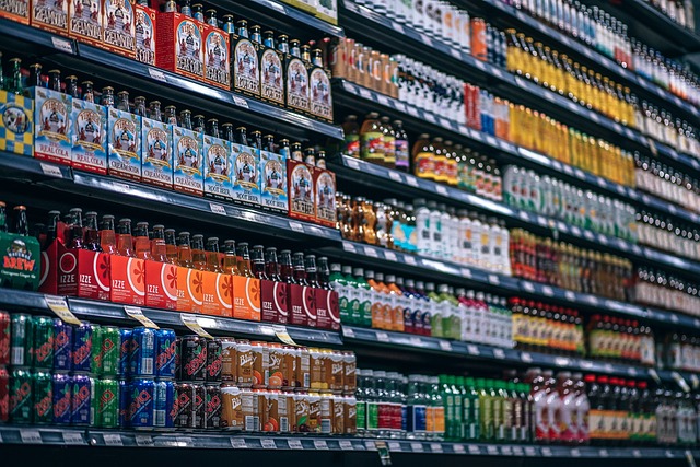
Eye-Level Placement
Position popular and high-margin products at eye level where they are most likely to be noticed.
This technique takes advantage of the eye-level is buy-level principle, which suggests that items placed at eye level are more likely to be purchased.
Example: Walmart
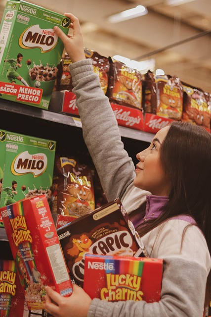
Walmart places leading brands and their own higher-margin Great Value products at eye level on shelves.
By placing specific products at eye level, Walmart increases their visual saliency, making them more likely to be noticed and chosen. This also plays into the effort heuristic, as these products require less physical effort to reach and examine.
– Visual Saliency: Eye-level products naturally draw more attention.
– Effort Heuristic: Items that are easier to reach (requiring less effort) are perceived as more desirable.
The Power of Three
Group related products in sets of three to create visually appealing displays that attract attention.
This technique leverages the rule of three, a principle that suggests groups of three are more engaging and memorable to customers.
Example: Apple
Apple often displays its products (e.g., iPhone, iPad, MacBook) in groups of three on tables.
Apple’s use of triadic displays creates a visually balanced and cognitively fluent presentation that’s easy for customers to process and remember, enhancing the overall appeal of their products.
– Rule of Three: Information presented in threes is more engaging, satisfying, and memorable.
– Cognitive Fluency: Groups of three are easy for the brain to process.

Cross-Merchandising Magic
The strategic placement of complementary products together to boost sales by encouraging customers to purchase additional items that enhance or complete their initial choice.
Example: Costco
Costco often places complementary items together, like positioning barbecue sauces near grills or placing wine glasses near wine bottles.
By strategically placing complementary items together, Costco primes customers to consider purchasing multiple items. This also leverages the bundling effect, where items presented as a set are perceived as having greater value than when presented individually.
– Priming: Seeing related products primes customers to think about using them together.
– Bundling Effect: Presenting items as a set can increase their perceived value.
The Psychology of End Caps
End caps capitalize on high visibility and ease of access, strategically showcasing featured products to attract attention and encourage purchases.
Example: Target
Target uses end-cap displays to showcase seasonal items, new products, or special deals.
Target’s end-cap strategy leverages pattern interruption to capture attention as shoppers move through aisles. By often featuring limited-time deals, they also tap into the scarcity principle, motivating quicker purchase decisions.
– Pattern Interruption: End caps break the shopping routine, attracting attention.
– Scarcity Principle: Limited-time or exclusive offerings on end caps create a sense of urgency.
The Decompression Zone
The decompression zone is the area just inside a store’s entrance where customers adjust to the new environment, preparing them for a more focused and relaxed shopping experience.
Example: IKEA
IKEA’s store entrances typically open into a large, open area with eye-catching displays before guiding customers into the main shopping areas.
IKEA’s decompression zone allows customers to mentally transition into “shopping mode.” This area primes customers for the IKEA experience, setting expectations and preparing them for the journey through the store. It also allows time for sensory adaptation, reducing the likelihood of overwhelming customers upon entry.
– Sensory Adaptation: Allows customers to adjust to the new environment.
– Priming: Sets the tone for the shopping experience ahead.
Flow Design: Creating a Smooth Customer Journey
Effective flow design ensures smooth movement throughout the store, reduces congestion, and enhances the overall shopping experience.
Natural Traffic Patterns
Observe and analyze natural traffic patterns within the store to identify high-traffic zones and areas prone to congestion. Use this data to create a layout that supports smooth traffic flow and minimizes disruptions.
Example: Macy’s
Macy’s uses heat mapping technology to analyze customer movement and adjust product placement accordingly.
By analyzing and adapting to natural traffic patterns, Macy’s creates a more intuitive shopping experience. This application of behavioral mapping allows them to nudge customers towards high-value areas without overt direction.
– Behavioral Mapping: Understanding and leveraging natural human behavior.
– Nudge Theory: Subtle environmental changes to influence behavior.
Clear Pathways
Design clear pathways that guide customers through the store in a logical and intuitive manner. Avoid clutter and obstacles that could impede movement or create bottlenecks.
Example: IKEA
IKEA’s stores feature clearly marked pathways that guide customers through different room settings.
IKEA’s layout reduces decision fatigue by providing a clear path through the store. This choice architecture nudges customers to view all products while the cognitive ease of navigation enhances overall satisfaction.
Choice Architecture: The clear path subtly guides customer behavior.
Cognitive Ease: Clear pathways reduce mental effort, making the shopping experience more pleasant.
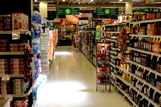
Signage and Wayfinding
Use clear signage and wayfinding cues to help customers navigate the store effortlessly. Effective signage reduces confusion, enhances the shopping experience, and encourages exploration.
Example: Whole Foods
Whole Foods uses clear signage and wayfinding cues to help customers navigate their stores.
Whole Foods places prominent, easy-to-read signs at strategic locations throughout the store, including directional signs, department labels, and promotional signs. This helps customers find what they need effortlessly.
Effective signage reduces cognitive load, decreasing confusion and enhancing the shopping experience. Clear wayfinding encourages exploration.
The Science of Store Layouts
Various retailers use grid, loop, and free-flow layouts based on their specific needs.
1) Grid Layout (Grocery Stores like Safeway): The grid layout is used to create a systematic, organized shopping experience. This layout is efficient for stocking and helps customers quickly find items.
– Behavioral Concept: This layout minimizes decision fatigue by providing a predictable structure.
2) Loop Layout (IKEA): The loop layout guides customers through a predetermined path, ensuring they see a wide range of products.
– Behavioral Concept: This layout increases exposure to products and encourages buys.
3) Free-Flow Layout (Boutiques like Urban Outfitters): The free-flow layout allows for a more relaxed, exploratory shopping experience.
– Behavioral Concept: This layout encourages browsing and creates a more enjoyable shopping environment.
Aisle Width Wisdom
Discover the optimal aisle width to prevent the “butt-brush effect” and keep customers comfortable.
Example: Costco
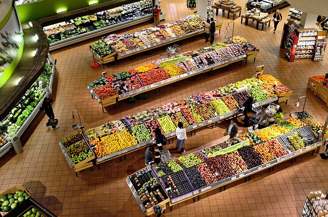
Costco features notably wide aisles in their warehouse stores.
Costco’s wide aisles prevent the “butt-brush effect” (customers avoiding crowded aisles), encouraging more time spent browsing and potentially increasing purchases.
– Personal Space Theory: Wide aisles respect customers’ need for personal space.
– Approach-Avoidance Conflict: Comfortable spaces encourage approach behaviors.
Queuing Theory in Practice
The strategic design and management of waiting lines to optimize customer satisfaction and operational efficiency, often leveraging psychological principles to influence perception of wait times and fairness.
Example: Whole Foods
Whole Foods often uses a single-line, multiple-server queue system.
This system leverages people’s preference for perceived fairness. The constant movement in a single line keeps customers occupied, reducing perceived wait times and improving the overall experience.
– Perception of Fairness: Single-line queues are perceived as fairer than multiple lines.
– Occupation Theory: Keeping people occupied (moving in the line) reduces perceived wait time.
Behavioral Insights: Encouraging Exploration and Increasing Dwell Time
Harness the power of psychology to keep customers engaged and shopping longer.
The Left-Turn Tendency
The Left-Turn Tendency refers to the observation that, in environments where people circulate freely, they tend to turn left more often than right.
This behavior can be influenced by various factors, including cultural norms, natural human tendencies, and the layout of the space.
Many Walmart stores are designed with their main entrance on the right side of the building, encouraging customers to naturally turn left upon entering.
Walmart leverages the left-turn tendency by positioning high-margin items and promotional displays immediately to the left of the entrance.
This design takes advantage of customers’ natural inclination to turn left, increasing the visibility and potential sales of these strategically placed products. The layout aligns with customers’ spatial bias, making the shopping experience feel more intuitive and comfortable.
– Spatial Bias: People tend to have a slight leftward bias in visual attention and movement in Western cultures.
– Default Effect: By designing the store to align with this natural tendency, Walmart makes the left turn the “default” option.
IKEA’s famous store layout typically begins with a left turn into their showroom area after customers ascend the initial escalator or stairs.
IKEA’s use of the left-turn tendency is part of their broader strategy to control the customer journey through the store. By aligning the start of their showroom with customers’ natural inclination to turn left, IKEA creates a seamless and intuitive beginning to the shopping experience. This initial left turn primes customers for the guided journey that follows, making them more receptive to IKEA’s carefully curated product displays and room setups.
– Choice Architecture: The store layout is designed to guide customers in a specific direction, aligning with their natural tendencies.
– Priming: The initial left turn primes customers for the journey through the store, setting expectations for the shopping experience.
In both examples, these companies are leveraging a subtle but powerful aspect of human behavior.
The left-turn tendency, rooted in spatial bias and potentially influenced by factors like the direction of written language in Western cultures, is used to enhance the customer experience and potentially increase sales.
By working with this natural inclination, these stores create layouts that feel intuitive to customers, potentially reducing cognitive load and making the shopping experience more comfortable and engaging.
It’s worth noting that while this tendency is observed in many Western countries, it may not apply universally. Stores in countries where people drive on the left or where the dominant reading direction is right-to-left might need to adapt this principle accordingly.
The Power of Surprises
The Power of Surprises refers to the strategic use of unexpected elements or changes in the store layout to rekindle customer interest and encourage exploration. This concept leverages the human love for novelty and the dopamine release that comes with discovering something new.
Costco regularly rotates the location of many non-staple items in their stores, creating a “treasure hunt” experience for customers.
Costco’s strategy of regularly changing product locations taps into our innate novelty-seeking behavior.
This creates a sense of exploration and discovery for customers, encouraging them to traverse more of the store.
The variable reward schedule of finding unexpected items keeps customers engaged and coming back, as they never know what they might find.
Additionally, the perception that some items might not be available on their next visit (scarcity) can drive purchases.
– Novelty-Seeking Behavior: Humans are naturally drawn to new and unexpected stimuli.
– Variable Reward Schedule: Unpredictable rewards (in this case, finding unexpected items) can be more motivating than consistent ones.
– Scarcity Principle: The perception that certain items may not be available on the next visit increases their perceived value.
Sephora frequently updates its store layouts, particularly in its central “New & Now” sections, and rotates brand displays.
By regularly updating its store layouts, Sephora prevents habituation, keeping the shopping experience fresh and engaging for repeat customers.
These changes create curiosity gaps, motivating customers to explore the store more thoroughly to discover what’s new or moved.
The mere exposure effect comes into play as customers encounter products in new locations, potentially increasing their interest in items they might have previously overlooked.
– Habituation Prevention: Changing layouts prevents customers from becoming too accustomed to the store environment.
– Curiosity Gap: New layouts create a knowledge gap that customers are motivated to fill.
– Mere Exposure Effect: Exposing customers to new products by changing their locations can increase liking for these items.
Putting It All Together: Your Action Plan for Store Layout Optimization
- Conduct a Store Audit: Use our comprehensive checklist to evaluate your current layout.
- Create a Heatmap: Learn how to use foot traffic data to identify hot and cold zones in your store.
- A/B Testing for Stores: Discover how to run controlled experiments to continually refine your layout.
- Technology Integration: Explore how digital signage and mobile apps can enhance the in-store experience.
Remember, the perfect store layout is an ongoing process of refinement and adaptation. By applying these principles and continuously analyzing your results, you can create a dynamic, engaging store environment that delights customers and boosts sales.
Ready to revolutionize your store layout? Let’s get started!
